Let’s have a little chat about colour. I know it’s a scary topic and we might even touch on pattern, which I think maybe some people find even scarier. But with 2023 coming up in the rear view And colour and pattern really looking like they are set to push their way in whether we like it or not I think it might be worth chatting about.
How we can introduce colour and pattern in a not so scary, much more exciting way? Especially with whites and greys, if you guys still have a lot of greys in your home, this is the perfect opportunity to start switching things up a bit. Similarly, if you have a lot of whites, let’s get some colour in there. It really lifts the spirits. And let’s not say scary, let’s say exciting!
You may have seen on Instagram a lot lately, those of you who follow other interior designers and don’t worry, I won’t get upset. It’s fine. You may have seen a lot more colour coming in and a lot more pattern.
A lot of the big name paint brands are also coming out saying their colours for 2023 are pretty intense. I must say, I’m not that keen on quite a few of them. What I do agree with however, is that colour is definitely about to have a bit of a moment. We’ve had white for a really long time and every single shade of it, which of course cane be beautiful when done right.
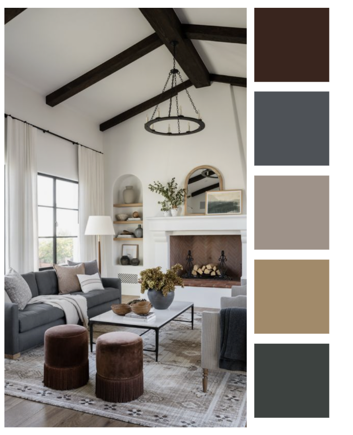
We’ve had ALL the grey, which let’s just not talk about. We’re better than that now. Sorry if I’m offending anyone there, but I think you agree, you know deep down somewhere that the grey has had its moment.
And even when we’re talking about whites, the whites have warming up, we’re coming towards the sort of Chanel creams rather than this stark white that a lot of people started to go for.
So with all that in mind let’s start chatting a little bit about colour, what’s going to be coming through, what I’m seeing come through, and what I’m starting to really warm to.
The colours for 2023 I would probably describe as a bit scary are the bright ‘Raspberry blushes and the pastels mostly, and this strange green. Yeah, fair enough, if you want to do a design stand somewhere and do something really punchy. Great. But I don’t think these are colours that you actually want to bring into your home, maybe in a kid’s bedroom, maybe as an accent, but definitely not as a full wall colour.
Case and point…
There’s Raspberry Blush by Benjamin Moore and generally I’m a big fan of BM but this colour is like a raspberry sorbet that you might get on holiday somewhere that you REALLY don’t want dripping on your white dress. It wouldn’t look out of place in a Barbie home or some sort of kid’s plastic toy.
We don’t want to go for colours just because they’re in. Never go for a colour just because it’s in, use colour trends as a great way to find new colours that you love, don’t just paint your room because some paint brand told you that you should, the love of a colour lasts more than a year.
I think colours of the year are very much geared towards consumerism at it’s best. I would almost go so far as to say they are often punchier colours because those are the type of colours you’ll get bored of fast and therefore want to paint your walls yet again – that would be a clever master plan for the paint industry wouldn’t it!
There aren’t many people that want to live day to day in a room that has like crazy designs in it. That’s why people don’t create rooms like the ones you see on changing rooms, and don’t invite Laurence Llewelyn-Bowen to design their homes. No offence Lawrence, but there’s a time in the place.
The Raspberry Blush might be nice for some shelving and a children’s bedroom. Or if you look at doing the door, or skirting, something like that. Possibly picture frames or a little bit of painted furniture, Not a wall.
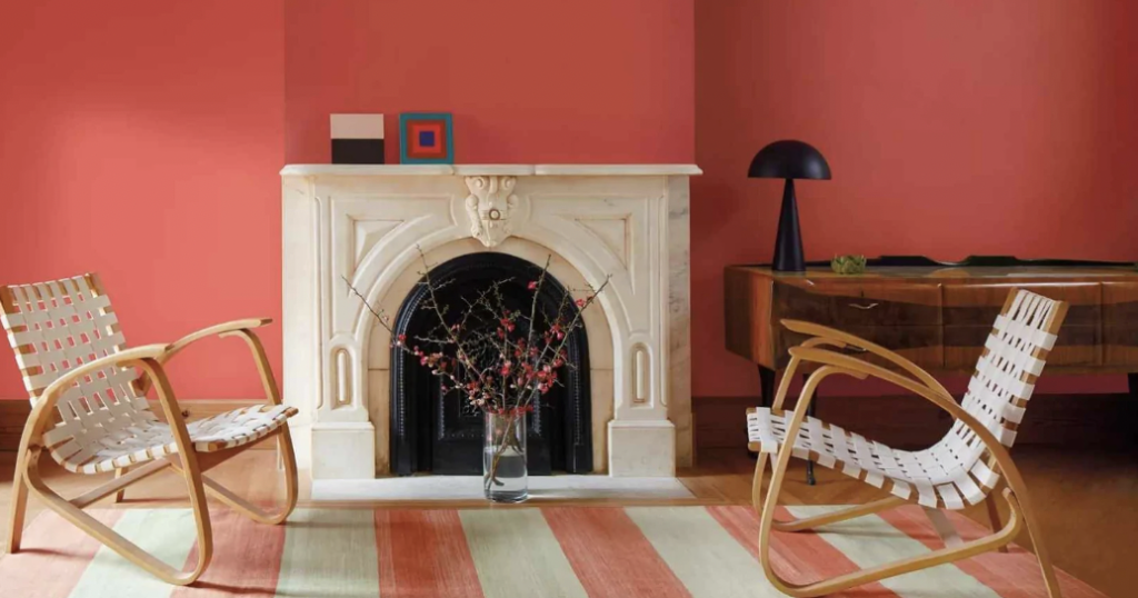
Then there is a Terra Rosa by Dunn Edwards, that’s nicer, though I still wouldn’t go with it, I feel it’s a sickly version of the nice plumb raspberry colour you might see in a traditional dining room which is something I am very fond of.
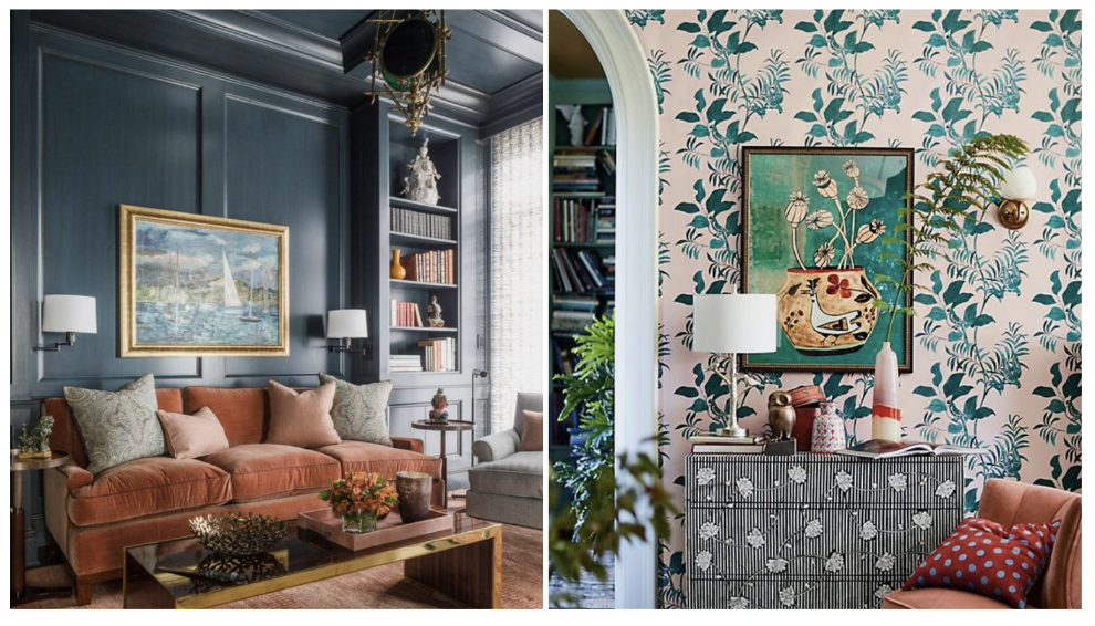
More of a Graham and Brown Merlot or Ca’ Pietra’ s Asher’s Cranberry I keep heading towards these colours as a great accent option. They look really nice brought in through foliage too when you’re picking flowers or plants for room. They also work really well punching through creams and whites. Although a strong tone, because it’s more of a natural colour it doesn’t punch you in the face as much something more in the Children’s Play-Doh territory. As a rule, you’ll find that the more natural colours, the greens, the blues, the deep reds, can be a lot more intense without making you feel uncomfortable in a room.
When they’re thinking about using a bold or possibly dark colour in a room do gain confidence from the fact that this won’t be seen in as much volume as you sometimes imagine before you have decorated.
It’s something I often find with clients, when they envisage a bold colour choice they imagine the entirety of the room in said colour and they don’t take into account where that colour will actually be visible which often, is not that many places. So let’s take a bedroom, if it has a fireplace with a large mirror above, a large cupboard or built in wall, windows, curtains etc. You’re not going to see much of that colour, similarly with wallpaper.
I think it’s also important not to let using a bold colour choice or wallpaper take over a room and be the hero of that given scheme or design. Let it still act as a background. Still put artwork up, have a feature rug or a feature bed, or some other main focus in the room other than the walls.
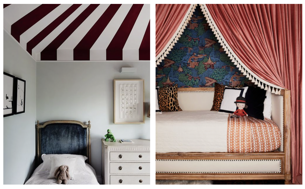
If you just want to introduce a small bit of colour, to a room introducing colour into the woodwork, is a lovely idea. A sash window painted in a different colour is a great touch too along with a matching skirting board. You can even paint a ceiling or wallpaper it which is a great option in a children’s bedroom, powder bath or dressing room.
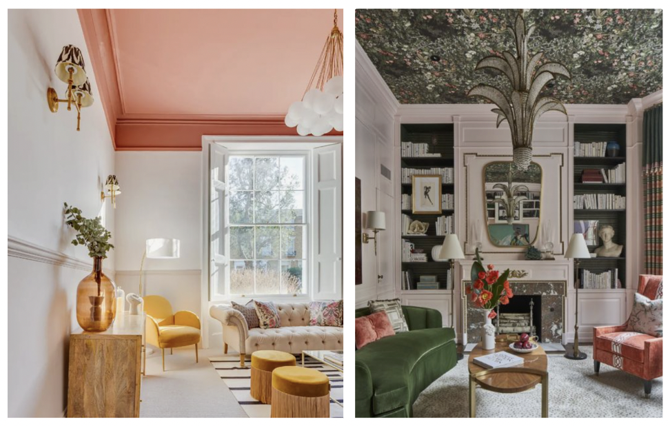
Go for more nature-ish greens and blues tone if you want to paint or wallpaper a ceiling, because that’s what your eye expects above you, the tree canopies above us, the sky etc. That’s why ceilings are generally painted lighter. It’s because that’s what you are used to. It feels correct for the ground to be a darker colour and above you to be a lighter colour. It’s a key feature of Biophilic design idea for our interiors to emulate and make you feel more connected to the outdoor world. It makes us happier.
If you’re still not comfortable with which colours to go for it’s a great exercise to find images of rooms online/on Pinterest and Instagram that you really love and really study them to count out the number of different colours they have used.
I guarantee there’ll be way more than you think there are. Include everything outside of black, grey and white. When you really deconstruct these images, you realise that there is much more colour than you think.
Obviously children’s bedrooms are great places to experiment with colour too, to go a little bit more bold and a little more crazy. It won’t give them a headache. It won’t freak them out.
Listen to the rest of Lu’s thoughts on colour in the recent podcast episode ‘Let’s Talk Colour!’